Hello!
In my last post I did a review of the first new Cici & Sisi Jumbo Set (click here to see it if you missed it) and promised I'd be back with Jumbo Set 4, which has to be awesome because it's RED!!
This set also has 6 plates (19-24), and each are half-and-half, the top half rollin' collage-style while the bottom half plays it old-school with some individual full-nail images.
Here is PART 1 of the video:
And here is PART 2:
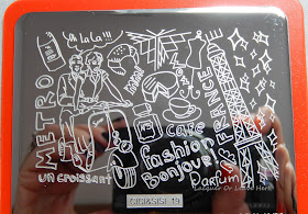
And on to the still and stamping tests! Here is plate 19:
 |
| Cici&Sisi 19 top half: The Parisian Experience |
.JPG) |
| Cici&Sisi 19 bottom half: Not very Paris at all |
The top half of this one has a French/Parisian theme with a fun, whimsical theme. The bottom images don't match up with it exactly, but there are some great images here.
But how does it stamp?
Beautifully. And how great would that flower be for lead-lighting???
On to plate 20:
 |
| Cici&Sisi 20 top half: Not gonna lie, I have no clue |
.JPG) |
| Cici&Sisi 20 bottom half |
The top half of this plate has a theme of...um...well, it says 'dog', and there is a candy cane and...fashion with love song? Aw, frick it, I give up. The top half of this plate was made for the expression 'it is what it is'. And the beauty of a collage-style image is that you can use whichever part you want whenever you want, so you can isolate the parts that go with whatever theme you're going for.
But while we're on the subject of 'random' and 'wha?', Let's talk about 'Lorem Ipsum'. I didn't know what that meant, so I looked it up. It's a typesetting term for when you're putting together a piece of print/graphic design/whatever and you need to stick in some nonsense words as a place holder. So as best I can figure this is either a setting error and something else (like 'Call me!') was supposed to be in there, or, it's a really awesome sardonic hipster joke about how pointless and empty all of the time we spend gabbing on the phone is. I am choosing to believe it's the second. (I am also secretly in love with the fact that the spaceship seems to be looking at that image and going "Huh?"...for some reason that just cracks me up.)
I think there are some fun images on this plate that can go far, particularly once you break down the collage portion--so let's see how it stamps!
Pretty darn good, my edge smooshes aside. :)
Next, plate 21:
.JPG) |
| Cici&Sisi 21 top half: Peaceful Asian garden |
.JPG) |
| Cici&Sisi 21 bottom half |
Okay, we're back to a design that I can describe with relative ease, lol. The top half of this has a beautiful Asian garden feel, although the images on the bottom half have decided to all go their own way. Especially the 'Don't touch me' guy, who I both adore and am sort of frightened of all at the same time.
This stamping test needs a little explanation...Anytime on any plate where you have large solid area, you have to be careful how you stamp it, or you can get bald spots in the image. That's what happened to the angry guy on the left--on his neck and shoulder you can see the bald spot from where I scraped. So I tried a second time and scraped from a different angle, and you can see it minimized the spot almost completely. After a few tries, I'd figure out the right direction/pressure to use to get rid of it completely. So just like with any other image that has a wide solid area, you may have to play around with it a bit. You'll see this again below.
Next--plate 22:
 |
| Cici&Sisi 22 top half: Awesome cubist skeletal paradise |
.JPG) |
| Cici&Sisi 22 bottom half |
This one. THIS ONE. So awesome. This is my favorite of both sets, if I could marry a nail plate, I would marry the top half of this one. It would have to be a polygamous relationship, of course, because there are some MoYous and Bunny Nails plates I would have already married, but...wait, this is getting weird.
Ahem. The point is, when I look at the collage section, I see cubism. I see Picasso. I see Day of the Dead. I see Halloween. I see awesomeness.
The bottom section has a couple of images that go along with it, and there are also a few on other plates that work with it as well.
In terms of stamping test, other than my smudgyness (this was one of the first plates I tested, so I was still figuring out the stamping-directly-down-on-paper thing), you can see the same issue with the groovy chick's head that I had before--just another of those broad, big spaces that you have to be careful of. Not the fault of this plate per se (notice the broad areas in the other images here came out fine), just always a challenge with this sort of image. So try scraping from different angles and vary your pressure as needed. :)
On to plate 23:
 |
| Cici&Sisi 23 top half: Gothic goodness |
.JPG) |
| Cici&Sisi 23 bottom half |
The collage portion of this plate goes goth, baby! The designs could certainly be used for other types of designs, but that's what comes to mind when I see it. There are several images on the bottom that you could coordinate with gothic looks, or a more garden-centered design. Tons of possibilities with this one. :)
Crisp, pretty stamping. :)
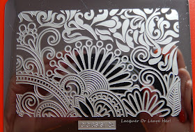
And finally, plate 24:
 |
| Cici&Sisi 24 top half: Paisley perfection |
.JPG) |
| Cici&Sisi 24 bottom half |
This was the very first plate I tested, and you can see how heavy handed I was, since I'd never tested this way before. So look past the smudging, to the completeness of the stamping. If you're not sure what I mean, look at the difference between the left and right 'pass' images: I'm sure you can guess which was my first and which was my second attempt. :)
To finish up the review, let's take a look at how big the images are:
 |
| Cici&Sisi 24 vs. Konad |
.JPG) |
| Cici&Sisi 24 vs. ruler |
 |
| Cici&Sisi 24 vs. ruler |
My apologies to my non-US sisters and brothers--I looked all over my house for anything that had centimeters, and came up empty handed. So I leave you to do the conversion as necessary--and we can all thank President Carter for failing to follow through on taking the us to the metric side.
My overall estimation of the plates? Once again, excellent quality, good value for the price. This set of six currently sells for $29.99 on Amazon, or $5 per plate, plus storage container. What it boils down to is whether or not you like the images on the plates--if there are images here you want to use, grab the set. If it leaves you cold, take a pass. But don't hesitate on the basis of unknown quality, because as far as I can tell, they're top-notch.
If you're a bit hesitant about using the collage-style sections of the plate, check out some of my how-to-use posts to get ideas (here in my Tips, Techniques, and Tutorials section), and if you want to know how to isolate part of an image like that, check out my tutorial on that here.
I hope you're having a great week! Hugs!
M.
(Disclosure: this website may be compensated for linking to other sites.)
.JPG)
.JPG)
.JPG)
.JPG)
.JPG)
.JPG)
.JPG)
.JPG)
.JPG)
.JPG)

.JPG)
A lot of fun possibilities! Look forward to your manis!
ReplyDeleteThank you so much! I am touched by your faith in me. :)
DeleteGreat review (both sets!)!! Because I'm crazy and MUST OWN ALL THE SETS, I will purchase this set (I received set 3 last week) eventually but it honestly doesn't do much for me. The collage parts seem disproportionate (same with set 3 for the most part) and the other designs are either weird as hell or been-there-done-that. I will say that the top half of plate 24 is worth the $30 price tag alone!
ReplyDeleteYou and me both. Own ALL da plates, I say!!!! And I agree that the originality of the individual images isn't the most impressive I've seen, but I do love those collage portions (the Picaso-esque one is worth it alone for me!) and there is enough in the full-nail images that I'm okay with it. :)
DeleteSuch fun stamping plates these are!
ReplyDeleteTotally agree!
DeleteI can't stop laughing about that Lorem Ipsum stamp haha! I seriously wonder if they just forgot to replace the text. I would totally rock that stamp to my design classes (:
ReplyDeleteMe too!!!! I soooo want to know the truth. I'm totally going to use that phrase on my nails just so people will ask me what it means, lol!
DeleteI absolutely love them all - but I haven't even got any of the first sets yet :)
ReplyDeleteHey, who says you have to go in numerical order? ;-)
DeleteFabulous and thorough review! Thank you!
ReplyDeleteThank you so much for checking it out!!!
DeleteBrilliant idea for using all the lil stampers one tends to collect over time for decals!
ReplyDeleteYes! And the dent didn't come out of the one I got with the yellow set. I'm trying to decide if I should get them to send me a new one...
DeleteI'm not a stamper but it's still fun to see the different images. I love the look of the Gothic plate and that leetle croissant way up there is tres cute hahahahaha :D Angry dude looks like the drawings from these books I used to love as a kid... They were little kid self help books. I never took anything to heart, lol, (I probably should have) but I liked reading them, nonetheless.
ReplyDeleteKid self-help books?? You have intrigued me. Tell me more about them, I need to know...
DeleteHa, I love that "don't touch me" guy. :D And, ahem, your comments about that groovy 70s chic - suuure. ;) (at least, that's the feel I got there. Anyway. Whatever. :))
ReplyDeleteThese all seem.. so wtf and random! :D Especially that "lorem ipsum" -- what, did they really just forget the intended sign or is it supposed to be..open for interpretation (I like your view on it)? Even the UFO is all "huh?" there. :) Fun.
Comments...I don't remember any comments...>.>...lol!
DeleteI really, really want to know if that was a slip-up but I have a feeling I'll never know...::cries::